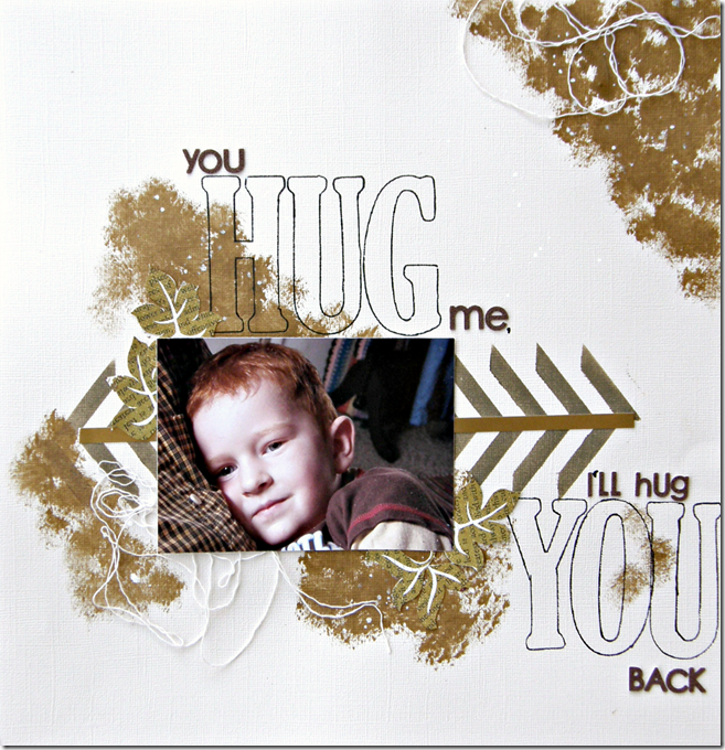
Coming to you a little late from the Color Room Palette #114, this layout I created a week or so ago. Monochromatics have never challenged me so much! In the end though, it was worth the effort to sort this one out.

Here’s my take. The gold is there, really… but I used a metallic and it photographed kind of dull.
The large traced letters were inspired by a layout I found on Pinterest from Janna Werner (the girl has mega talent!)
Thanks for taking a peek!
~Alyssa~


No comments:
Post a Comment